What You Need to Know About This Sea Ice Chart

By:
A new chart of global sea ice garnered a lot of attention this week and sparked debate on social media over what exactly it reveals about climate change. In short: It suggests alarmingly low levels of ice in both the Arctic and in the Antarctic.
The chart is based on data from the National Snow and Ice Data Center.
"It's global sea ice area — meaning both the Arctic and Antarctic," said Zack Labe, a Ph.D. student in the earth system sciences department of UC Irvine and the person who originally tweeted the graph, speaking to The Verge. "We typically associate recent low sea ice cover (from climate change and natural variability) in the Arctic, but not the Antarctic. In this case, both the Arctic and Antarctic are at record lows for the date."
The graph was based on easily verifiable NSIDC data (corroborated by Japan's Aerospace Exploration Agency, which also tracks polar ice), The Verge reported.
There's a caveat.
The NSIDC told The Verge that it was neither practical nor appropriate to represent Antarctic and Arctic data in the same chart:
"The combined number, while easy to derive from our online posted data, is not useful as an analysis tool or indicator of climate trends. Looking at each region's ice extent trends and its processes separately provides more insight into how and why ice extent is changing. Sea ice in the Arctic is governed by somewhat different processes than the sea ice around Antarctica, and the very different geography of the two poles plays a large role. Sea ice in the Arctic exists in a small ocean surrounded by land masses, with greater input of dust, aerosols, and soot than in the Southern Hemisphere. Sea ice in the Southern Hemisphere fringes an ice-covered continent, Antarctica, surrounded by open oceans. While both regions are affected by air, wind, and ocean, the systems and their patterns are inherently very different. Moreover, at any point in time, the two poles are in opposite seasons, and so a combined number would conflate summer and winter trends, or spring and autumn trends, for the two regions."
But why do the data show a sudden drop in sea ice area?
The NSIDC is reportedly asking a NASA scientist to help provide an explanation.
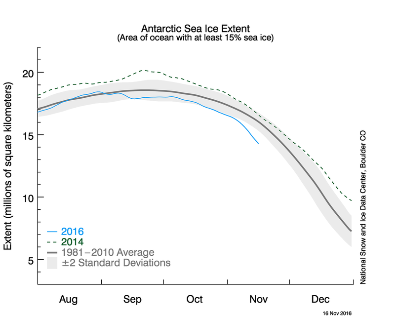
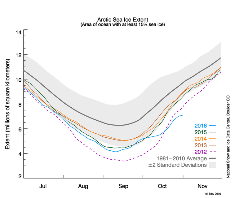
Even separate NSIDC graphs look as shocking as the combined chart the NSIDC criticized.
 NSIDC - nsidc.org
 NSIDC - nsidc.org
The NSIDC explained the reason for slow ice growth in the Arctic: "A primary culprit behind the slow growth is that sea surface temperatures in the Beaufort and Chukchi Seas, the Barents and Kara Seas along the Eurasian coast, as well as the East Siberian Sea, were above average. ... As noted in our post last month, the Arctic is losing its oldest and thickest ice."
[h/t The Verge]
