Here's How You Stack up to Every Other Person Making Money in the U.S.

By:
A new income percentile calculator can show you exactly where you stand financially compared to the rest of the working population in the U.S.
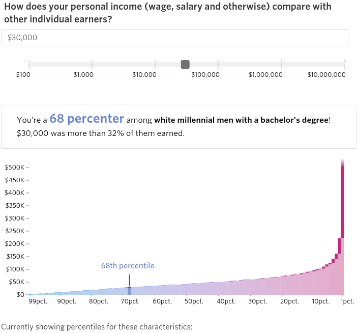
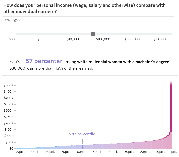
The calculator, which is an interactive feature on The Wall Street Journal, measures your percentile based on your gender, race, generation, and education level. The chart uses information from the Census Bureau and includes figures from people ages 16 and up who made more than $0 in 2014.
As one example, a white millennial female with a bachelor's degree who makes $30,000 a year is a 57 percenter among white millennial women with a bachelor's degree. White millennial men with the same credentials would be in the 68th percent among their specific group:
 Wall Street Journal - wsj.com
 Wall Street Journal - wsj.com
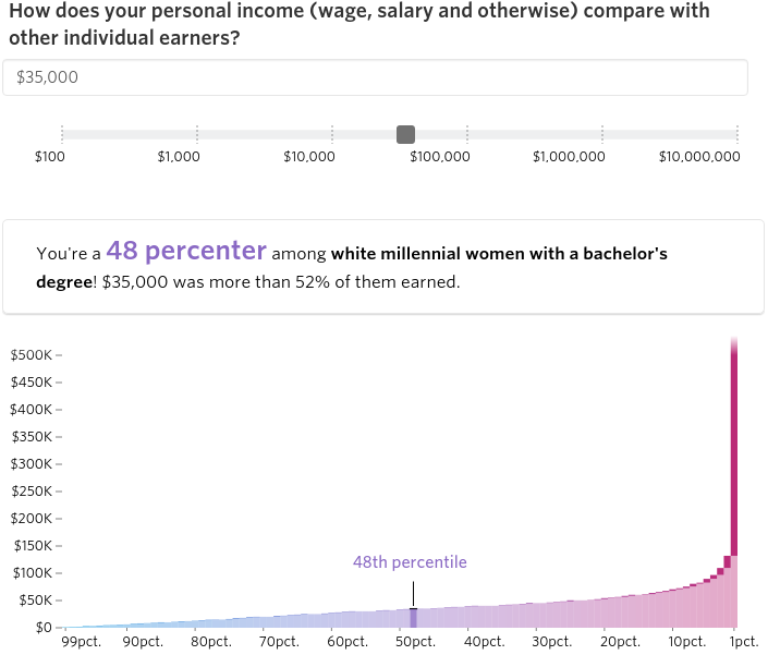
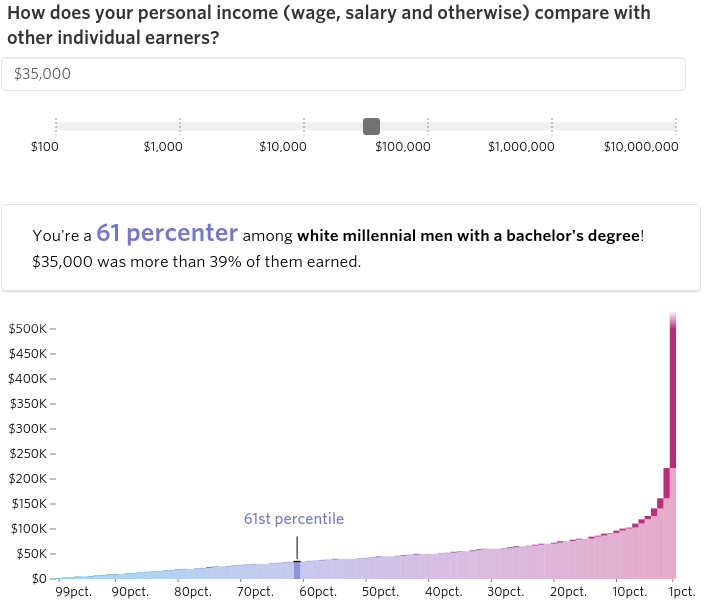
White Millennial women with bachelor's degrees making $35,000 per year are in the 48th percentile for their group, and men with these identical credentials are in the 61st percentile:
 Wall Street Journal - wsj.com
 Wall Street Journal - wsj.com
Keep your line of work in mind.
 Dirima - bigstockphoto.com
Though The Wall Street Journal chart is helpful in knowing how you stack up against other workers financially, it doesn't account for one's chosen profession or measure how much a person is making compared to those in his/her specific field. For example, if a white female Millennial with a bachelor's degree is a teacher and earning only $30,000 per year, she might be in the top 57 percent of women in this group, but she is still making less than the national average salary for teachers.
In addition to profession, it's also important to consider one's location, as certain cities pay really high salaries for specific areas of work. As one example, a web developer has exceptionally good earning potential in San Jose compared to any other city, according to a 2014 U.S. News & World Report article. San Jose, of course, is located in Silicon Valley, a tech hotspot.
 Flickr/David Sawyer - flickr.com
Where the wage gap comes into play.
Some of the chart figures reflect the reality of the gender pay gap in the United States. A frequently cited statistic reveals that women earn around 77 cents on the man's dollar, or $435,049 less than men over the course of a 40 year career. The pay gap can also be especially disheartening for minority women as well. Last year, the Institute for Women's Policy Research (IWPR) published a report that found Hispanic and Black women make even less than 77 cents to a man's dollar, with Hispanic women earning just a little more than 50 percent as much as the average white man. According to the advocacy group Make it Work, which released a short comedy skit last year explaining the wage gap to little girls, the 2015 pay gap indicated that white women would lose $11,000, Black women would lose $22,000, and Hispanic women would lose $25,000 respectively per year.
To see how you measure up financially on the interactive feature, go to The Wall Street Journal's website.
